Grab Transport Booking UI Revamp
Tasked with redesigning the allocation and pick-up UI to enhance the transport booking experience.
2019-2020
My Role
Responsibilities included defining and scoping problems with the Product Manager, conducting ideation workshops, planning and participating in user research and design validation, collaborating with peer designers to create the new UI, undergoing design critique and review sessions, designing transition animations, creating design specs, and collaborating with the engineering/QA team for UI implementation until roll out.
Background
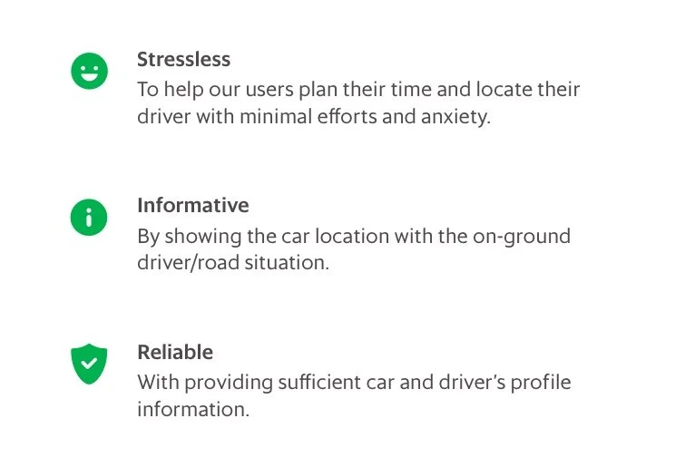
Throughout the ride booking user journey, the information displayed on the app plays a crucial role in the passenger's experience. Passengers rely on this information to plan their time, such as reading the driver's location or estimated arrival time, determining whether to wait for the driver, and deciding when to reach the pick-up point. Users also utilize this information to share with friends or family and for communicating with the driver.
“As a user, I want to know where my driver is, when will the car arrive, and what’s the car information so that I can get prepared for it and get picked up by the driver smoothly.”
Issues to Address
Upon reviewing the existing booking screens, several UI issues were identified:
Insufficient feedback or visual notification during the allocation progress.
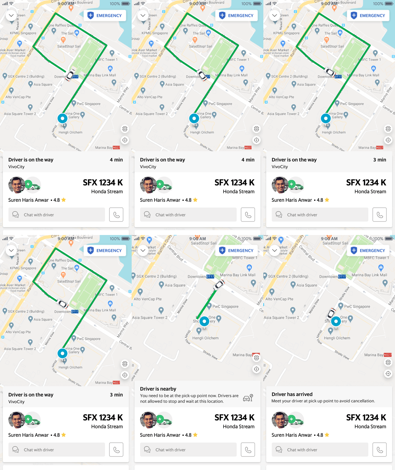
Overcrowded display of information in a small space with unclear information hierarchy while passengers wait for the driver.
Driver's name frequently gets truncated, and the small driver photo makes identification challenging. Additionally, limited space often leads to the truncation of the driver's name.
Success metrics
1. Decrease cancellation rates and boost booking through rates
During the allocation process, the goal is to shape users' perception of the allocation time and manage their tolerance for waiting. By providing more contextual information dynamically, along with clear instructions, we aim to reduce the cancellation rate, often caused by communication gaps between passengers and drivers.
2. Enhance passenger safety and NPS (Net Promoter Score)
While passengers wait for their drivers, making the card plate number, car model, and driver's information more legible on the UI can help passengers locate their upcoming driver more easily and safely.
Allocation UI redesign
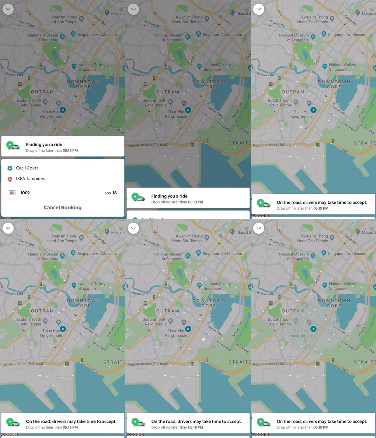
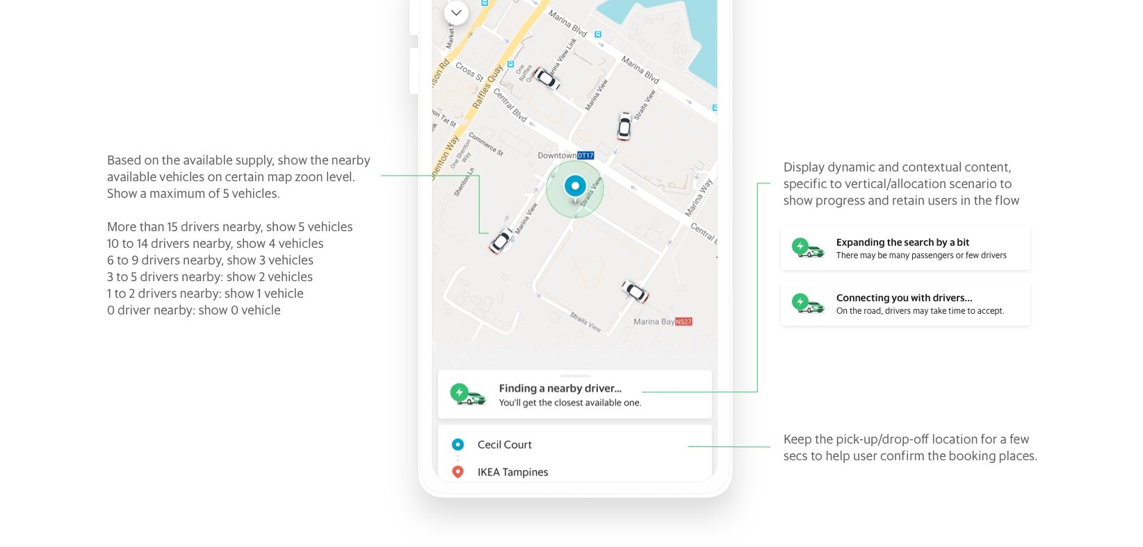
01 Showing available drivers on the map
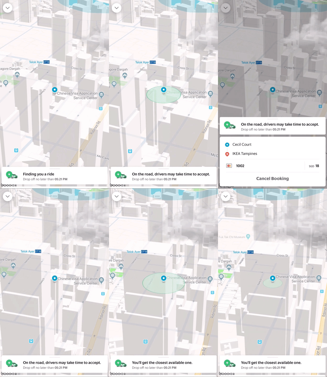
02 Simulate street view and weather in real world
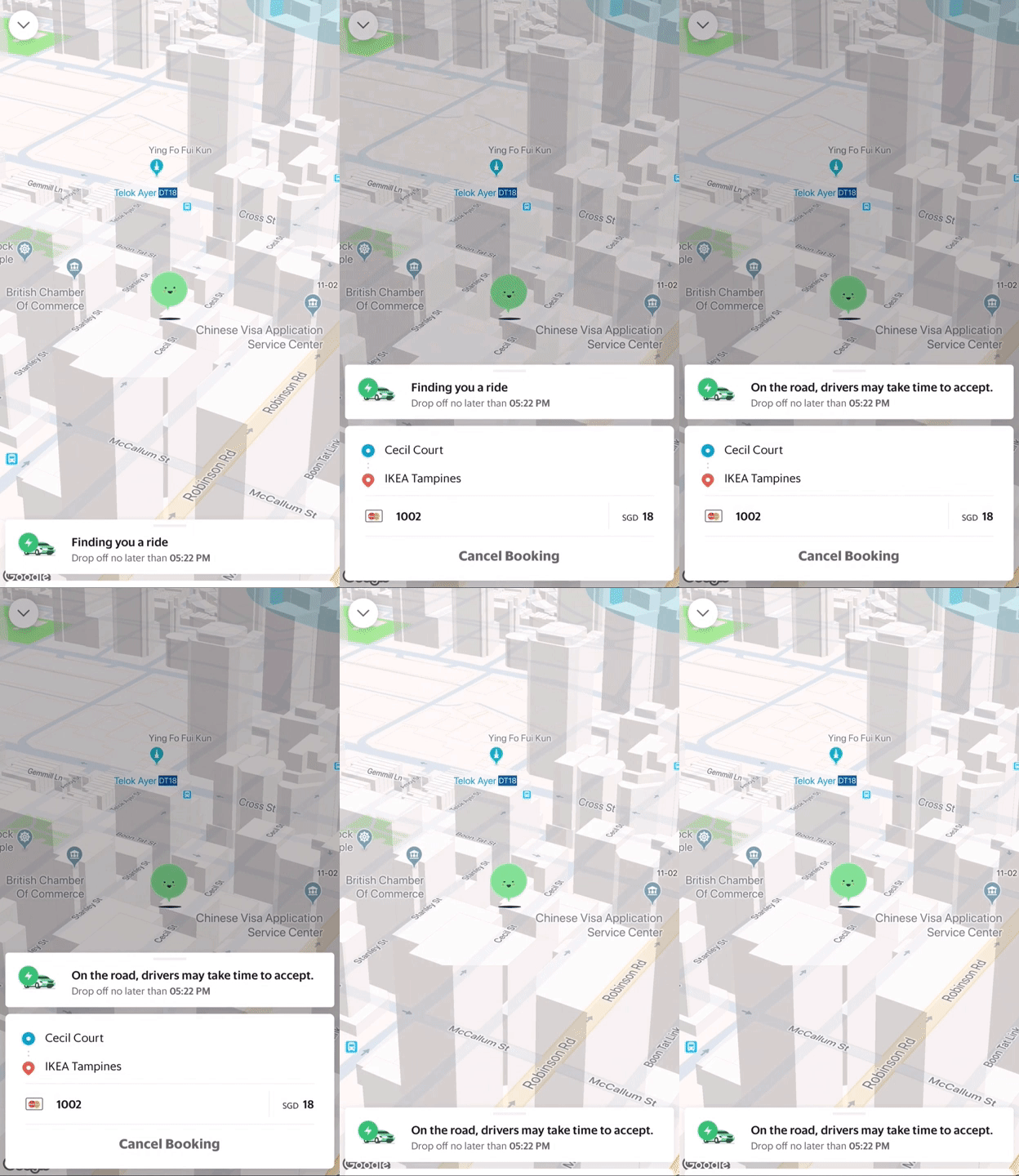
03 Animated avatar on 3D map
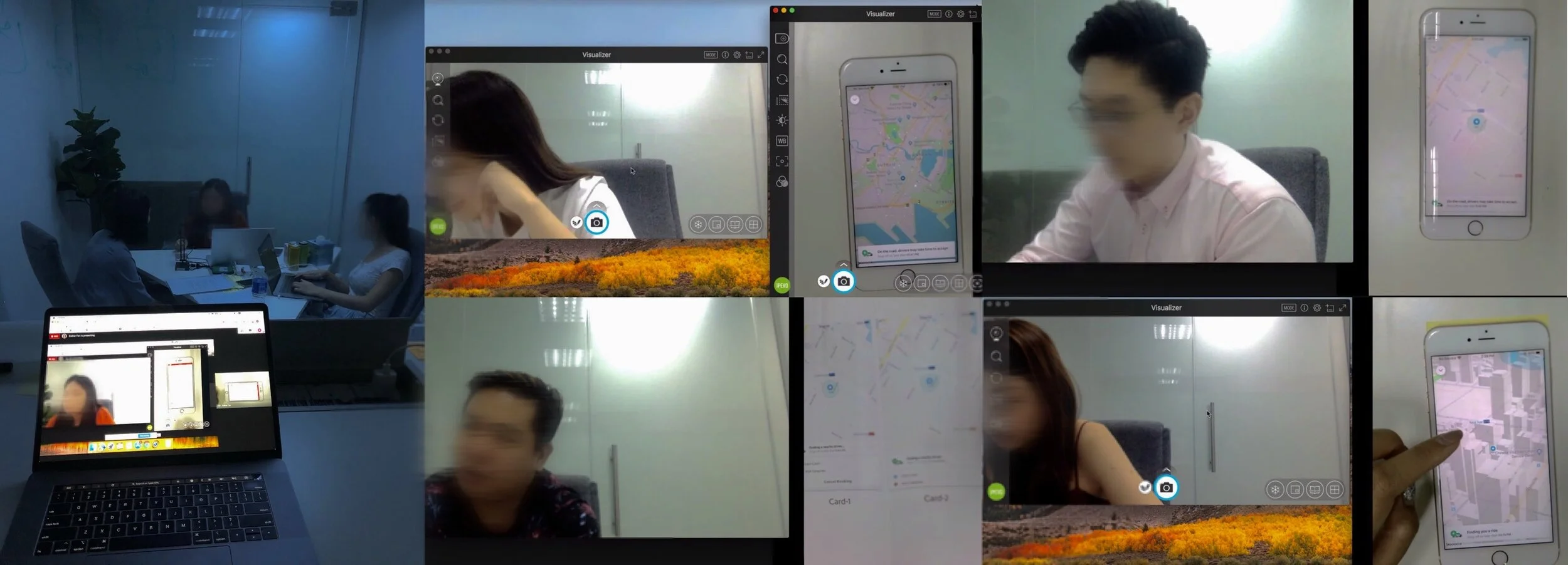
To better manage user tolerance and justify the wait, we first focused on redesigning the allocation experience. I created several designs using different approaches and tested them with real users. Through interactions with these prototypes, we aimed to gather user feedback based on their needs and past experiences.
Key enhancements included:
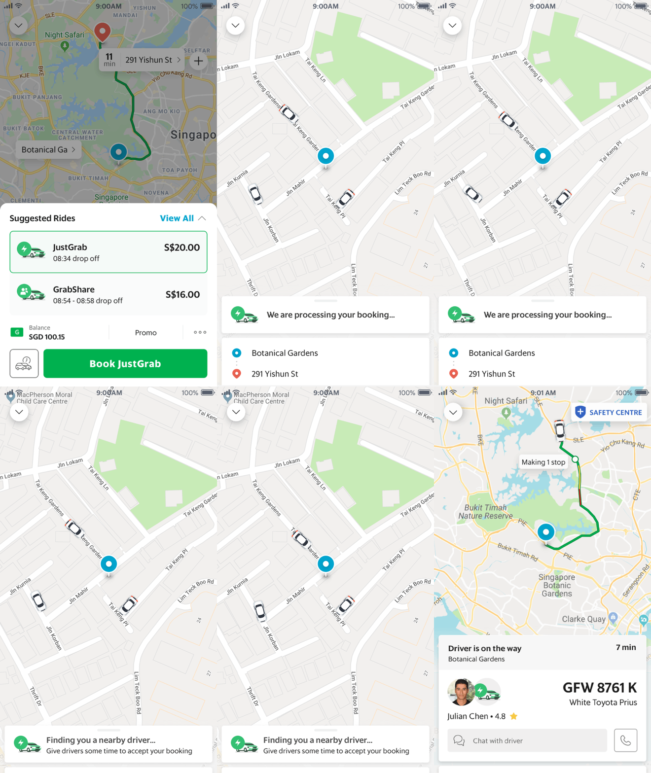
Displaying the allocation process: We ensured that users could easily track the progress of their booking allocation, providing transparency and reducing uncertainty.
Adding animations to engage users: We incorporated animations to distract users during the waiting period, enhancing the overall experience and reducing perceived waiting time.
Updating status messages in different phases: Clear and informative status messages were provided at various stages of the allocation process, helping users understand what was happening and manage their expectations accordingly.
We conducted tests with 8 users in Singapore who use JustGrab/GrabShare rides at least twice a week and have canceled at least 4 rides before allocation. From our research, we found that users seek assurance and alternatives while waiting for allocation. Among the three animations tested, users preferred to see certainty of getting a car rather than fancy animations. Additionally, more than half of the users liked the idea of being able to see available drivers.
"Grab could inform me of the number of nearby drivers on the allocation screen. If there are no drivers available, I can go to the road and look for a taxi."
- SG GrabCar user
“I would like to see the road on the map to ensure that I have booked at the correct location.“
- SG GrabShare user
Prioritize simplicity, speed, and informativeness in the allocation experience
Following the testing, I proposed a design that prioritizes simplicity, speed, and informativeness in the allocation experience. This design includes displaying nearby available drivers on the map to assure passengers of supply availability while they wait. Additionally, dynamic and contextual information specific to the vertical/allocation scenario is displayed to show progress and retain users in the flow.
By conducting an AB experiment in Jakarta and Manila, we discovered that the new design, which includes showing nearby available drivers on the map, significantly reduces the cancellation rate. Within the first 10 seconds of the allocation time, the cancellation rate is reduced by 24 percentage points in the new design compared to the previous one. Additionally, the pre-allocation cancellation times are significantly longer, ranging from 1.7 to 1.9 times longer than those of the previous design. Overall, the cancellation rate is decreased by 0.48 to 0.69 percentage points in the new design.
Improving the Driver's Card
The driver's information is crucial to our users. Leveraging our existing information and functionalities, I organized an ideation workshop to explore various states throughout the entire booking journey. This involved analyzing benchmarks and generating ideas for redesigning the visual hierarchy and layout of the driver's in-transit status and car information.
“30% of the users expand the card and scroll down for more inforamtion”
In the new design, we streamlined the Driver's Card by reducing unnecessary shadows, spacing, and visual elements. Simultaneously, we improved accessibility by implementing a new text style for the plate number, car model, and driver's profile.
When the card is expanded, instead of maintaining the same information architecture as when collapsed, the layout of the card dynamically transforms to engage users with more detailed information about their driver.
The final allocation and pick-up experience
What's Next: Enhancements to Overall Booking Experience
Moving forward, we aim to improve the overall booking experience from start to finish, encompassing booking, pick-up, and drop-off. In addition to revamping the allocation and in-transit card designs, I am actively addressing user pain points, assessing Net Promoter Scores (NPS), analyzing potential gaps, and identifying opportunities for improvement across the entire passenger lifecycle. We are committed to solving passenger's problems and enhancing the booking experience through design.
> See my next work: DBS/POSB digibank SG
