The New DBS/POSB Digibank SG: Banking Reimagined
Revamping the Everyday Banking App with a Fresh Native UI Design
2017-2019
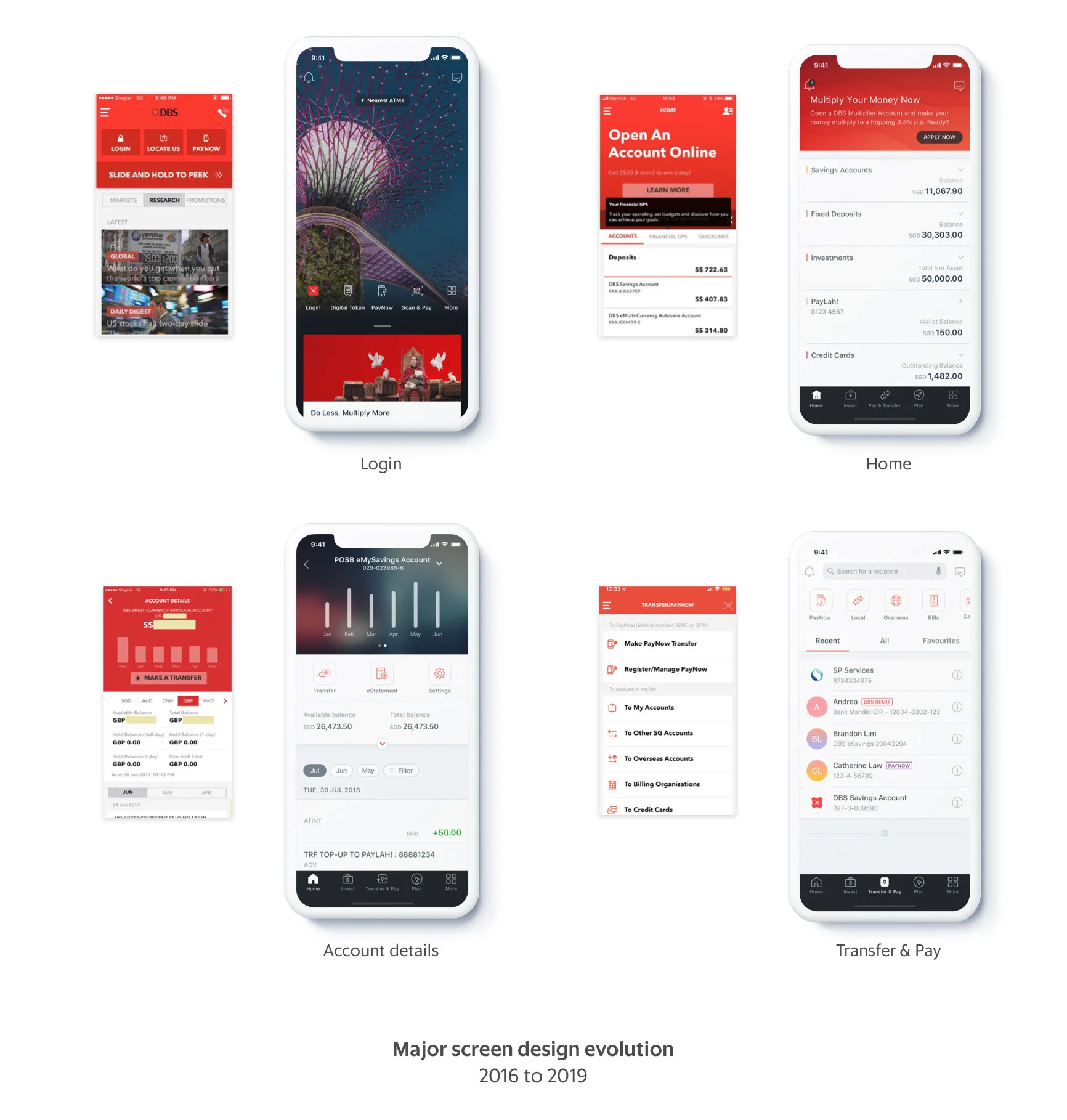
In 2019, DBS launched the new DBS/POSB mobile banking apps with an entirely new native UI in Singapore. This marked the most significant app revamp project for digibank since its initial launch in 2016. The design system developed alongside this project has also been implemented across iWealth, digibank India, Indonesia, Hong Kong, Taiwan, and various other DBS consumer apps.
My Role
As an interaction designer, I spearheaded the restructuring of the information architecture, redesigned the transfer user flows, collaborated with multiple business teams to secure buy-in, defined UI interactions, and established and managed the design system for the design team.
Background
Before 2017, many banking apps, including the initial launch of digibank, were not built with native code. Consequently, the app suffered from sluggish performance and complexity, particularly evident when users navigated through numerous pages to complete simple transfer flows. In late 2017, upon securing the necessary budget, we initiated this app revamp project to transition digibank into a 100% native app.
Consistency, scalable, and minimal impacts
The primary goal of this project extended beyond merely revamping the app's UI. We aimed to create a consistent banking experience across all DBS platforms, leveraging the opportunity to design universal native UI components that could be scaled for all other markets.
Design principles
Faster
Reduce the number of steps, provide helpful links and information users need at a particular moment, progressive content loading.
Simpler
Simpler to build: embracing native components, learning curve and becoming more future proof with new OS releases. Reuse components and patterns more.
Smarter
Provide meaningful suggestions, automate when possible, and help customers manage money easier.
IA Restructuring
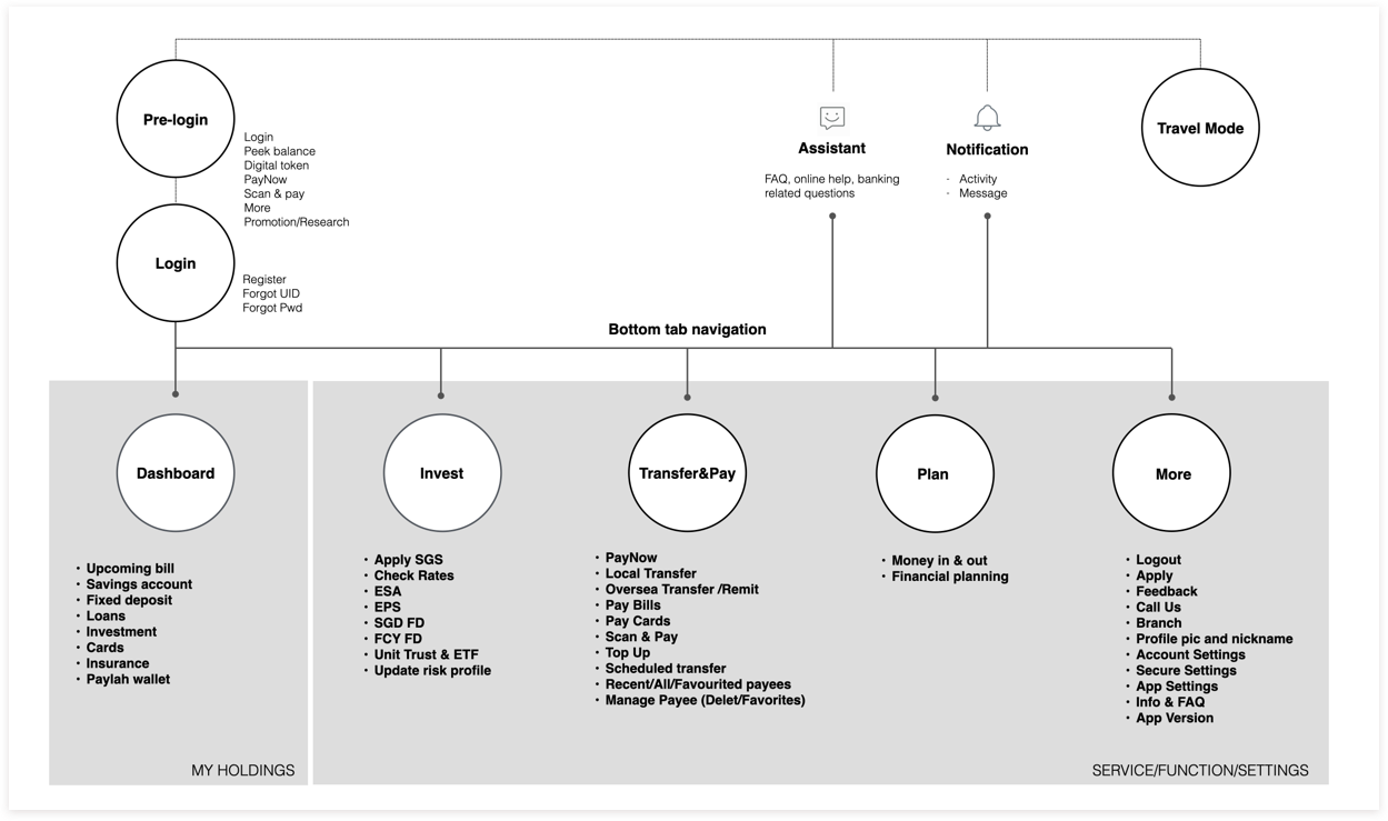
Rather than concealing content and features within the hamburger menu, the native app employs a bottom navigation design to provide users with quick access to various sets of information. The research team conducted card sorting analysis to validate that the new IA resonated well with our users.
Streamlining Access to "Fast Money"
After analyzing previous user data, we found that checking account balances, transferring funds, and paying bills were the top three tasks performed by digibank users throughout the app. In the new app design, we implemented several features to facilitate these "Fast money" activities:
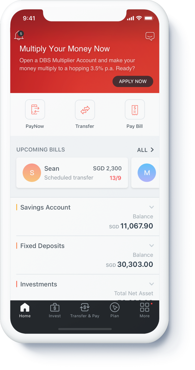
Quick Access Module: We introduced a module for frequently used functions, allowing users to quickly access essential features.
Upcoming Bill Section: A dedicated section displays upcoming bills or transactions, providing users with timely reminders. Tapping on the card directs users straight to the transfer/pay bill page.
Cross-Sell Opportunities
Cross-Selling Space: At the top of the Home page, we allocated space for promoting new products or features, creating opportunities for cross-selling.
Invest and Plan Tabs: In the primary layer of the bottom navigation, we included Invest and Plan tabs to serve as gateways for slower money activities. This not only offers educational resources for customers but also presents cross-selling opportunities for investment, loan, and insurance products.
Enhancing Alignment with Users' Mental Models
Users approach money transfers with varying mental models. To accommodate these diverse scenarios, we've strategically placed the transfer button across three key screens: Home, Account Details, and Transfer & Pay.
For users who primarily use digibank for payments, we've provided direct access to the Transfer & Pay page from the Home screen. This page prominently displays the payee/biller list, allowing users to initiate fund transfers quickly, reflecting their natural inclination to select recipients first.
Alternatively, for users who prefer to check their account balance before making transfers, they can seamlessly transition to the transfer process directly from the Account Details page. This approach aligns with their mental model of first assessing their financial status before proceeding with transactions.
App Navigation: Defining Clear Navigation Patterns
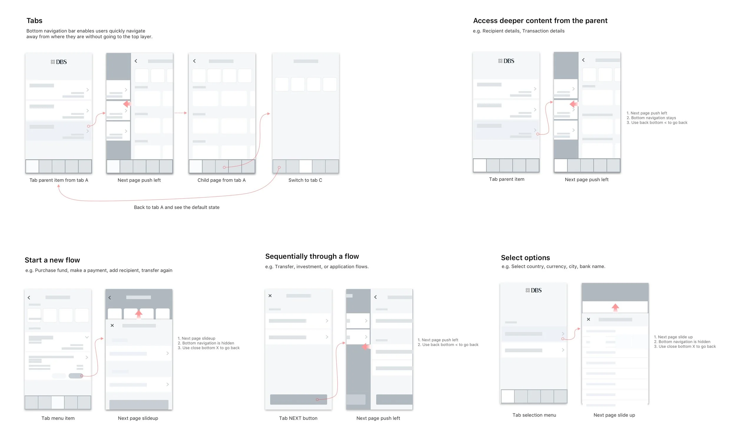
Effective app navigation is crucial for facilitating seamless user movement within the application. In our new design, we have defined various navigation patterns along with corresponding guidelines:
Tabs: Tabs are utilized to access deeper content from the parent, allowing users to navigate between different sections of the app easily.
Access Deeper Content from the Parent: Users can delve into subcategories or specific features within a parent category by utilizing tabs.
Start a New Flow: Tabs also serve as entry points to initiate new workflows or tasks within the app, providing clear starting points for users.
Sequentially Through a Flow: Users are guided through sequential steps or stages of a process using navigation controls, ensuring a logical progression through the app's features or functions.
Select One or Multiple Options: Navigation options are provided for users to select either a single option or multiple options based on their preferences or requirements within the app.
Navigation prototype example in iWealth app
User feedbacks
Since the launch of the new app in mid-2019, Digibank SG has received a rating of 4.6 with 18,794 reviews on Google Play. Overall, users find it easy to transfer money and access eStatements using the new UI. However, there is also a significant number of suggestions for improving the app's performance.
“This banking app helps me a lot, way further than i expect it to be, it really serves its purpose, to make banking easy for everyday people’s life, easy to use and understand, it has made my life worry free, paying my bills, and sending money to my family.”
> See my next work: DBS Design System
