JOOX Music
2016-2017
Not merely a music streaming app, JOOX also encompasses features for playing music videos, live show streaming, and even karaoke. As additional features are integrated, maintaining the app's ease-of-use becomes increasingly challenging, necessitating consistent interactions and simplified navigation.
Simultaneously, to adhere to the monthly app release cycle, we collaborate closely with the product and development teams. We frequently review and refine our design process to ensure the delivery of high-quality designs within tight schedules.

Building on the success of QQ Music in mainland China, Tencent introduced JOOX, a freemium music streaming service targeting other Asian markets, in 2015. Rapidly, JOOX Music emerged as the premier music streaming app in Asian markets, dominating the download charts in Hong Kong, Indonesia, Malaysia, Myanmar, and Thailand. In 2017, JOOX expanded into South Africa, marking its debut in a non-Asian market. It's projected that the number of music-streaming users in Asia will reach 87 million by 2020.
My Role
Collaborate with the PM to discuss and refine requirements, prioritize tasks, and assign responsibilities. Design the UI flow, wireframes, and animations for new app features. Conduct user studies, including user interviews and usability tests, to validate design decisions and inform future product direction. Manage design resources and schedules to ensure timely app releases with exceptional user experiences.
Responsibilities
Project management, UI flow and interaction design, wireframing, animation design, user research, and usability testing.
Our Process
Use wireframe and flowchart for estimating development feasibility and final visual design effort/timeline🗣
Build up UI library and use it across wireframing, final visual design and development 🧬
Make high-fidelity animation/micro-interactions in early stage💫
Iterative design validation based on data and user feedbacks👩🏻💻
Use component/pattern in wireframe Stage
To help the team better estimate the development efforts and deliver schedule, we always use component pieces for building up the screen or new feature early from wireframing stage. Whenever there’s any new component or library needed, it helps explore and confirm the design direction very quickly. It also saves time for those back and forth changes during the high fidelity design stage.
Consider Micro interaction in early stage
To push and help product team estimate the development effort in early stage, we usually design several animated hi-fi prototypes in a very quick way so the whole product team can select one design. The process avoid wasting too much back and forth time on revisions in the visual design stage.

Iterative design validation
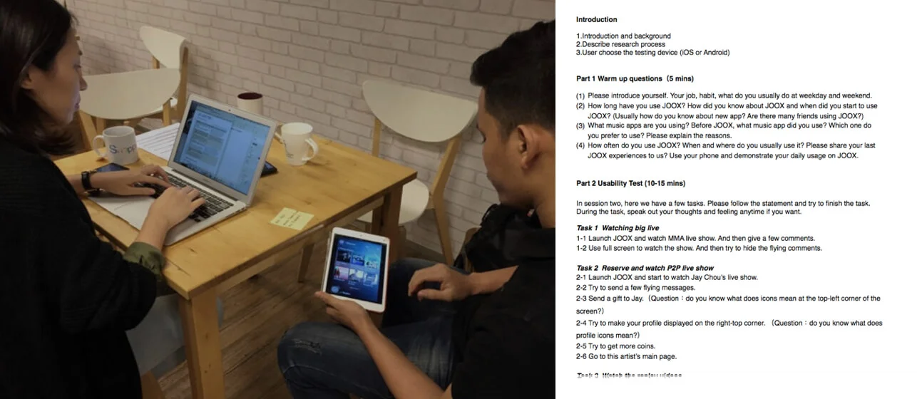
When there's new feature being designed or exploratory research needs, I played the researcher role to conduct qualitative user study in our regional office. The study usually started from users' daily usage of our app. Then users will be asked to go through our new features and complete tasks for those design we would like to test. The testing results from 8 to 10 users are collected, which address the existing issues, design suggestions and user insight in the report to push product team work further for following up enhancement in the next product release.
Android UI Revamp Concept
Among millions of daily active users on JOOX, 64% of our users are using Android phone. However, JOOX Android version was mostly using the same UI components as iOS without considering the Android UI guideline, which caused lots of development effort, performance issues and misleading interactions. Therefore we decided to revamp the Android UI in order to solve the following issues:
Replacing those iOS UI design by the new UI which follows Android guideline
Update the outdated design language
Build up extendable framework to fit in more content
Enrich brand’s value
01 - Discover current Issue
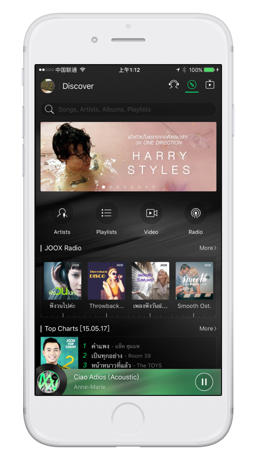
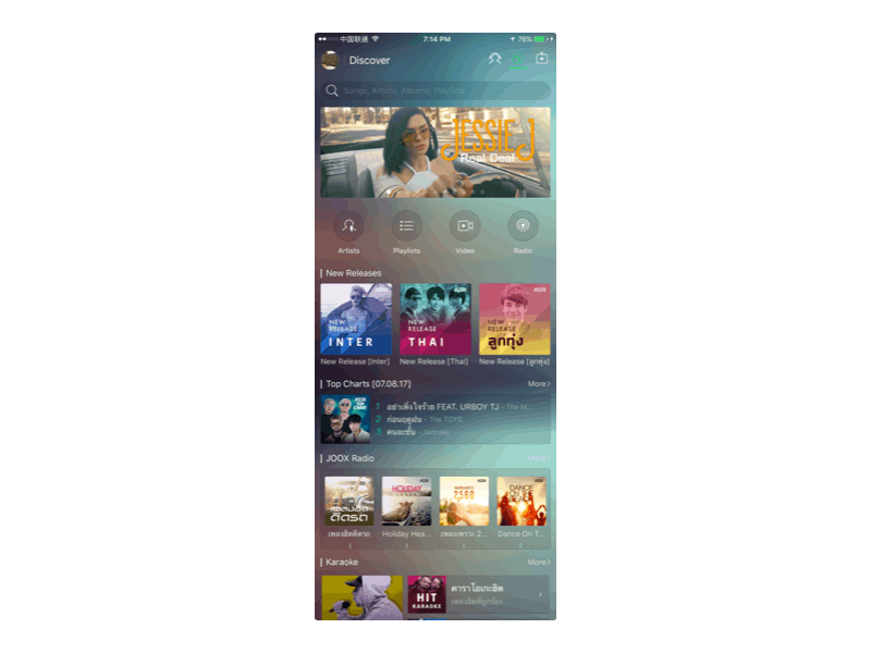
Lots of content cluttered on home page
In the original design, Discover page displays several different contents such as music, article and videos. For users who really want to search for certain song, they don’t really need to look too many non-related content type in the first-layer. Instead, we need to provide more content related to the artist or song itself when users look deep inside.
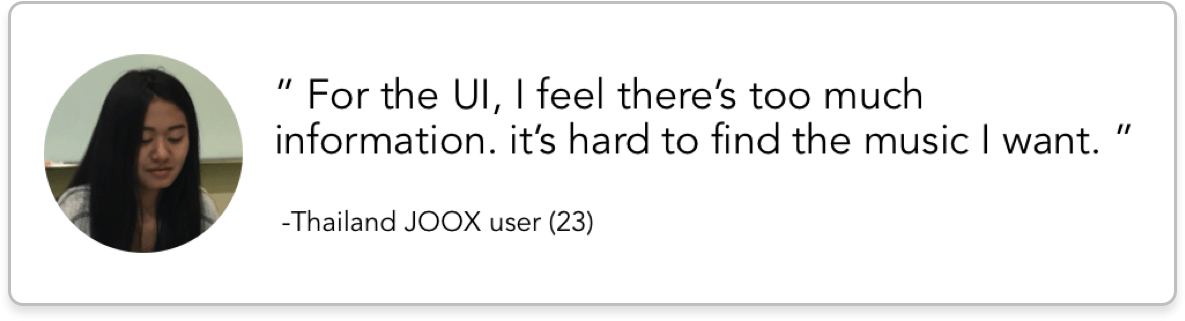
During the discover phase, I had the chance to run U-test with Thailand JOOX users. Part of our users feel the content on the main page is too much to use for them, which implies we need a better way to organise the content and keep the basic music experience working well.
02 - Define focus area
Provide a better user experience for Android user
Redesign the UI structure to make the app easy to use
Use Android design language and follow the guideline
Keep JOOX styling stands out and different from native app
Considering the scenarios of listening music, people use music app and listening music differently based on time, where they are and what they are doing. Therefore we defined our new UI structure basic on the different music listening scenario.

03 - Develop solution
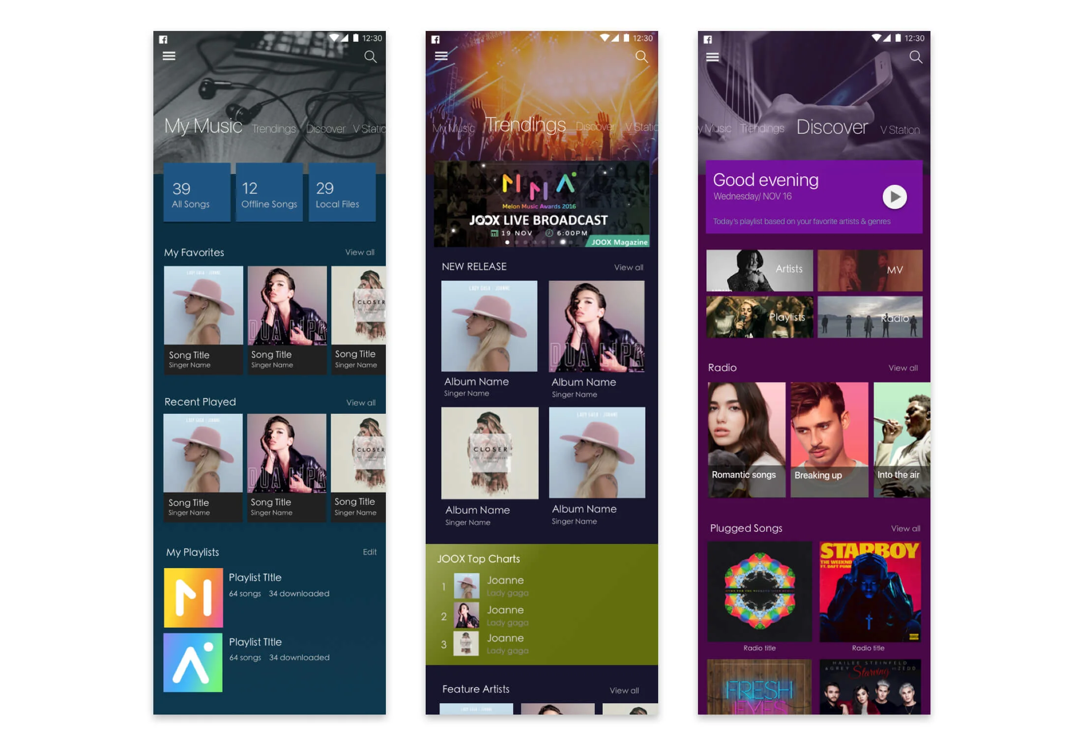
Information Architecture
For different scenarios, I reorganised the content and put them into several different entries, My Music, Trending, Discover For You and Search. And for more live show videos, users can still use the V Station tab to have the holistic video experience.
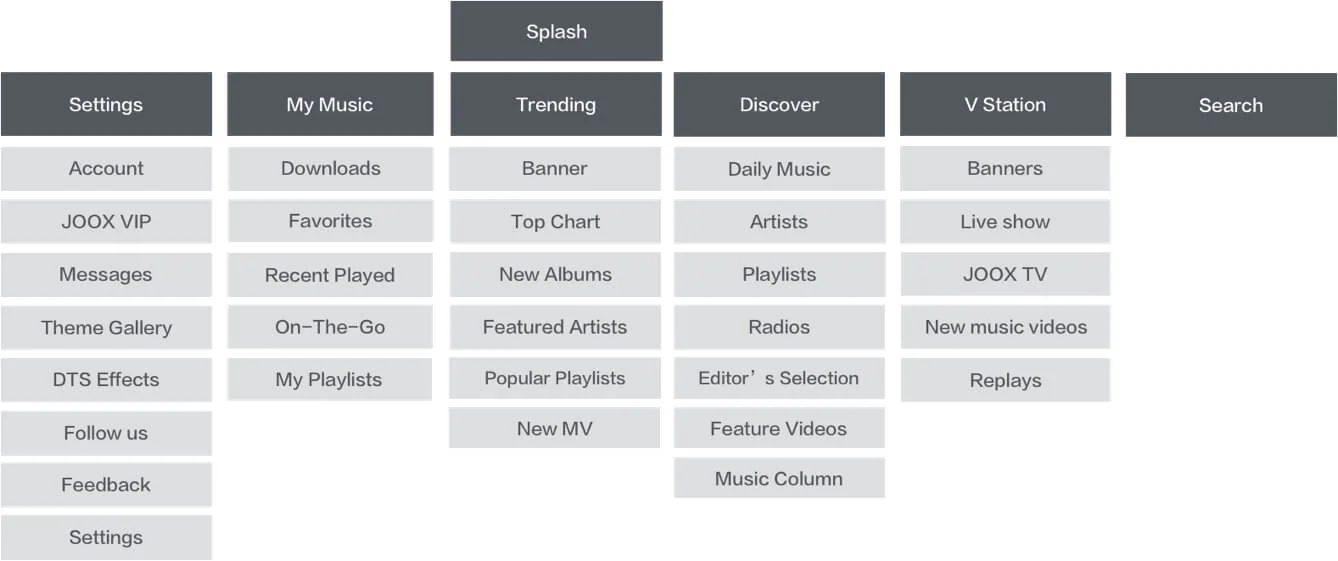
Define CONTENT COMPONENTS
To make the whole page being browsed in the best way, different contents are tweaked and presented in the easy-to-navigate structure. For example, daily recommended playlist, artist, album. top playlists are designed as different components so the content can be identify easier.
04 Deliver design
CLEAR PAGE STRUCTURE
The new IA is designed to let users easy to browse and search musics based on their needs. Top layer pages are separated by the way of listening music and serving for its own purpose. For example, Trending is for playing top hits music, featured artists or playlists, while Discover is for exploring the recommended playlists or albums.
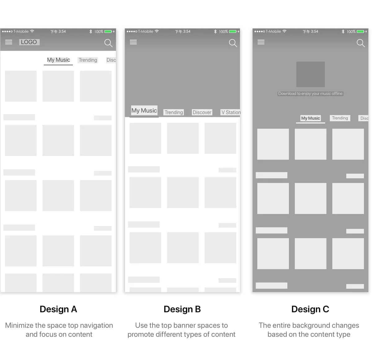
Immersive PAGE design
Use the context-relevant top images which are corresponded to the page content are designed to communicate. It helps users to navigate with more immersive experience. Also for holiday or event, there are more space for campaign design.

> See my next work: Tencent Gongyi - Charitable Crowdfunding Web App in WeChat